
The best outdoor patio colors depend on four things you need to nail down before you look at a single paint chip or fabric swatch: how much direct sun your patio gets, how large the space is, what fixed materials are already there (concrete, wood, stone, metal), and what climate you're dealing with. Once you know those four things, you can pick a palette that looks intentional, holds up for years, and doesn't turn into a maintenance nightmare.
Best Outdoor Patio Colors: Palettes by Material and Light

Lark Perry
9 Jul 2026
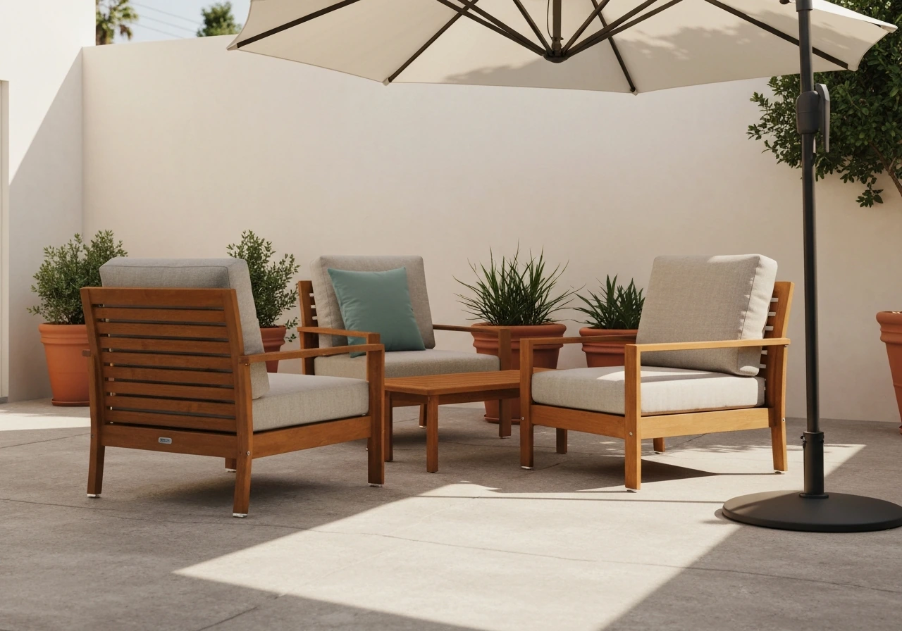
Start with your patio constraints
Before you fall in love with a color online, do a quick audit of what you're actually working with. These four constraints will shape every choice you make.
Light and shade
A fully sunny south-facing patio and a shaded north-facing one behave completely differently with color. In full sun, dark colors absorb significantly more heat because of their lower Light Reflectance Value (LRV). LRV is a 0-to-100 scale measuring how much visible light a surface reflects. A dark charcoal deck paint might have an LRV of 5, which means it's absorbing 95% of sunlight as heat, making the surface uncomfortable to walk on barefoot and accelerating the breakdown of finishes. In a shaded patio, that same dark color can look rich and intentional without cooking your feet. Pale colors with LRVs above 50 stay cooler but show dirt and pollen more readily in any light condition.
Size
Small patios (under 150 square feet) benefit from lighter, more unified palettes. Going too dark on a tiny space compresses it visually and makes furniture feel crowded. Larger patios can handle deeper anchor colors on flooring or walls because there's enough square footage to balance them with lighter furniture and open space. If you have a long, narrow patio, using the same color on the end wall and floor makes it feel even more like a tunnel. Instead, use a slightly lighter shade on the end wall to push it back visually.
Materials already in place
Your house siding, fencing, existing flooring, and outdoor kitchen are fixed elements you can't repaint every season. Make a note of their colors before you pick anything new. If your house is warm beige with brown trim, cool blue-gray patio furniture is going to fight with it constantly. If you have a red brick exterior, earthy terracottas and olive greens will feel cohesive while stark white furniture will feel disconnected.
Climate
Hot, sunny climates (think Arizona or Florida) accelerate UV fading on every surface, so lighter or mid-tone colors with proven UV-resistant coatings are smarter long-term investments. Humid climates (Southeast US, Pacific Northwest) mean mildew is a real concern on lighter surfaces, particularly on horizontal planes like furniture cushions and rugs. Cold climates with freeze-thaw cycles put extra stress on painted or stained surfaces, so flexibility of the finish matters more than color alone. Coastal environments add salt air into the mix, which attacks metal finishes and fades textiles faster than anywhere else.
A color strategy that always looks good
The most reliable patio color formula is simple: one neutral base, one accent color, and consistent undertones throughout. This works for every style from modern to cottage.
Neutrals as your anchor
Warm neutrals (greige, sand, warm gray, taupe) and cool neutrals (slate gray, blue-gray, true white) are your workhorses. Use the dominant material on your patio as your anchor neutral. If you have gray concrete, you're already in cool-neutral territory. If you have warm wood decking, you're in warm-neutral territory. Everything else should share that same undertone direction.
Accents and contrast
Pick one accent color and use it in two or three places: cushions, a planter, an umbrella, a rug border. One accent used consistently looks designed. Three different accent colors used once each looks like a clearance sale. For contrast, aim for a noticeable but not jarring difference between your largest surfaces and your accent pieces. Navy accent on a warm gray patio works because the contrast is strong but the undertones (both lean cool) don't fight. Bright red accent on warm gray concrete is high contrast with clashing undertones and tends to look louder than you want outdoors.
Undertones matter more outside than inside
Outdoor light is unforgiving of undertone mismatches. A cushion that looks taupe in a store will reveal its pink undertone next to your warm beige stone in full afternoon sun. Before committing to any fabric or paint, check the undertone by holding it against your fixed materials in the actual patio light. Warm undertones (yellow, red, orange) and cool undertones (blue, green, gray) generally shouldn't mix as anchor elements. You can break this rule with small accent pieces, but the large surfaces (floor, furniture frames, large cushions) should share an undertone direction.
Best colors by patio material
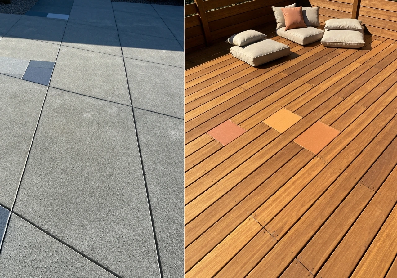
Different materials have different starting points, and some colors work much better with certain surfaces than others.
Concrete
Concrete's natural color is a cool, medium gray, which is one of the most forgiving neutral anchors you can have. It pairs beautifully with navy, forest green, charcoal, and warm white. If you're painting or staining concrete, medium gray, warm sand, or a slate blue-gray all work well and hide the inevitable dirt and scuff marks that concrete accumulates. Avoid stark white concrete paint in humid climates because mildew staining becomes visible almost immediately. If you want a lighter look, opt for a warm cream or off-white rather than a stark white.
Wood and composite decking
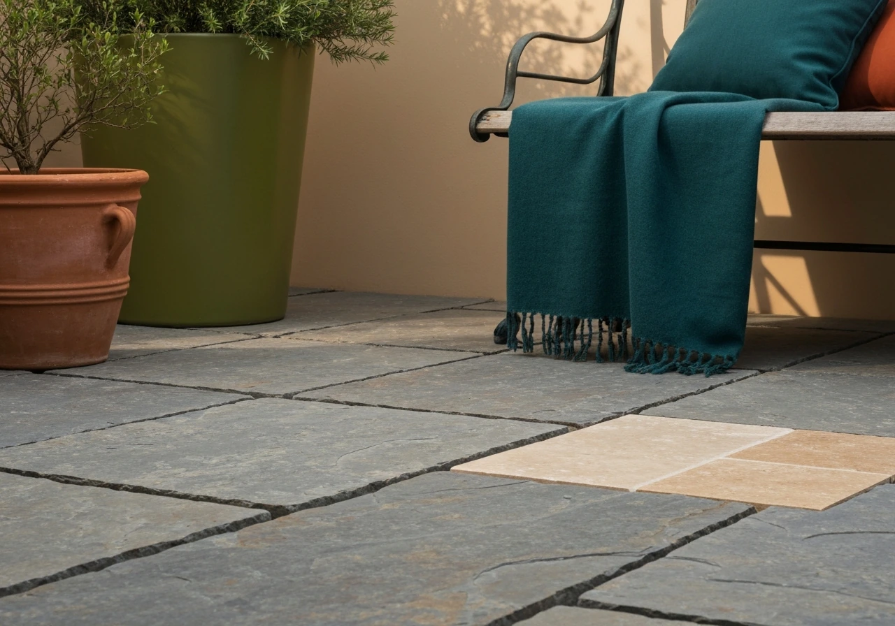
Natural wood decking sits in the warm-neutral family, so lean into warm tones: olive green, terracotta, deep teal, warm white, and earthy browns all complement it. If you're staining wood, semi-transparent stains in warm cedar, redwood, or honey tones age gracefully and hide wear better than solid-color stains, which can peel and look patchy over time. Composite decking tends to come in warm gray, brown, or tan tones and pairs naturally with the same palette as wood. Avoid cool blue-gray furniture frames directly against warm brown composite because the undertone clash becomes very obvious.
Stone and tile
Natural stone (flagstone, slate, bluestone, travertine) brings complex, varied tones that are actually very forgiving to work with because their natural variation absorbs minor color mismatches. Travertine and limestone lean warm beige, so work with olive, rust, deep blue, or warm white. Bluestone and slate lean cool gray, which pairs well with navy, forest green, charcoal, and cool white. Tile patios in terra cotta are already making a strong warm statement, and the best approach is to let the tile be the color and keep everything else neutral: white, warm linen, or natural rattan tones.
Metal (aluminum, wrought iron, steel)
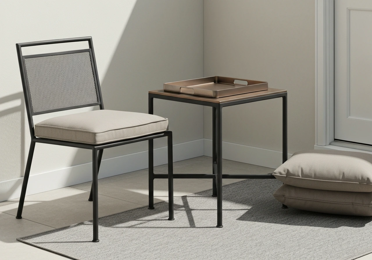
Metal furniture is almost always a neutral (black, white, bronze, silver), which means it's the most flexible anchor of all. Black metal frames are the most popular because they work with virtually every color scheme, from warm earthy tones to cool coastal palettes. One real-world caution: black metal in direct full sun gets extremely hot to the touch. If you have a sun-drenched patio, consider powder-coated white or bronze frames instead. White metal works best in modern and coastal settings. Avoid painting metal yourself with standard exterior paint since UV and temperature cycling will cause it to chip and peel within one season; powder-coated finishes from the manufacturer are far more durable.
Outdoor furnishings and fabrics: what holds up and what hides wear
Outdoor fabrics are where most patios fall apart visually over time, not because the color choice was wrong, but because the wrong fabric was chosen for the exposure level. When choosing the best outdoor patio bench, pay close attention to the cushion and fabric materials so they hold up to your sun and weather exposure Outdoor fabrics are where most patios fall apart visually over time. The key specs to look for are lightfastness ratings and blank" rel="noopener noreferrer">colorfastness to light.
On the Blue Wool Scale (0-8, where 8 is best), outdoor fabrics should have a lightfastness rating of at least 6 for covered or shaded patios, and 7-8 for direct sun or coastal exposure.
Outdoor fabric guides commonly use a lightfastness rule of thumb, with ratings around 6+ for covered outdoor use and around 7, 8 for direct sun or coastal exposure on the common lightfastness scale a lightfastness rating of at least 6 for covered or shaded patios, and 7-8 for direct sun or coastal exposure. Solution-dyed acrylics (the most common in quality outdoor cushions) typically hit the 7-8 range.
Fabrics dyed after weaving fade significantly faster because the dye sits on the fiber surface rather than being locked into the fiber itself.
Colors that hide wear best
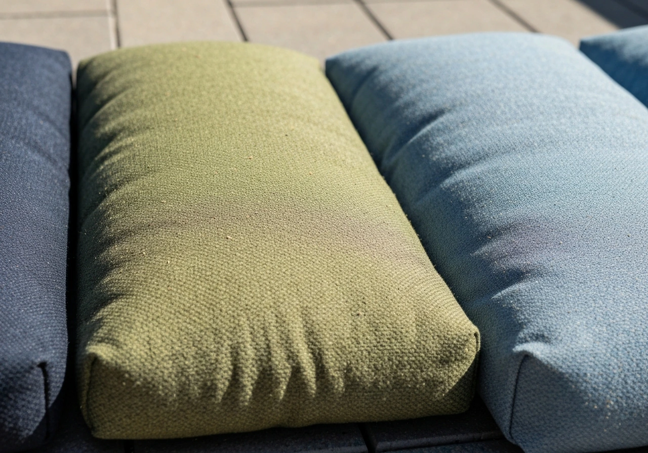
Medium-tone, slightly muted colors are the sweet spot for outdoor fabrics. Deep navy, olive green, warm charcoal, and dusty blue all hide dirt, pollen, and minor staining better than both very light and very dark options. Stark white and cream cushions show every bird dropping and pollen dusting immediately. Jet black cushions show dust and lint constantly. The middle ground of medium blue, sage, rust, or warm gray hides day-to-day grime while still reading as clean when actually cleaned. For rugs, the same logic applies: a flat-weave outdoor rug in a medium-tone geometric or stripe pattern hides dirt between cleanings far better than a solid light or solid dark option.
Colorfastness by color family
Some colors fade faster than others regardless of fabric quality. Reds and bright oranges are the most UV-vulnerable color families in outdoor textiles, even in solution-dyed fabrics. They tend to shift toward salmon or tan within two to three seasons of direct sun exposure. Navy, dark green, and gray retain their color significantly longer because the dye concentrations used to achieve those darker, cooler tones are more stable under UV. If you love warm reds or oranges, use them on shaded patios or in pillows that can be rotated and stored, not as primary cushion covers that sit in full sun year-round.
| Color Family | Fade Resistance (Direct Sun) | Dirt/Wear Visibility | Best Use |
|---|---|---|---|
| Navy / Deep Blue | Excellent | Low | Primary cushions, rugs, umbrellas |
| Forest / Olive Green | Excellent | Low | Primary cushions, planters, rugs |
| Warm Gray / Charcoal | Very Good | Low to Medium | Large cushions, furniture frames, rugs |
| Dusty / Muted Teal | Very Good | Low | Accent pillows, rugs, umbrellas |
| Terracotta / Rust | Good (shaded), Fair (full sun) | Low | Accent pillows, planters, covered patios |
| Warm White / Linen | Good | High | Modern/minimal setups; store when not in use |
| Bright Red / Orange | Fair to Poor (full sun) | Low | Shaded patios or seasonal accent pieces only |
| Stark White / Cream | Good (UV stable) | Very High | Rotate frequently; avoid as primary cushion color |
Coordinating the whole patio
A patio that looks pulled together isn't just about picking pretty colors individually. It's about building from the fixed elements outward, in a specific order.
- Identify your fixed anchor elements: flooring material and color, house siding or wall color, fencing, and any permanent structure like an outdoor kitchen or pergola.
- Determine your undertone direction (warm or cool) based on what those fixed elements are doing. When in doubt, hold a pure white and a warm cream next to your flooring. Whichever looks less jarring tells you your undertone direction.
- Choose your furniture frame color. It should either match your fixed elements closely (tone-on-tone) or be a clear, clean neutral (black, white, dark bronze) that works in either temperature family.
- Pick your primary fabric color for cushions and a rug. This should be your most intentional color choice and the one that introduces your palette's character.
- Add one accent color in two to three smaller elements: throw pillows, a planter, the umbrella canopy, or a lantern. This accent should share undertone direction with your primary palette.
- Use plants to soften and fill. Green is a universal connector, and plants tie together even imperfect color combinations. Vary plant textures rather than colors for a cohesive look.
Your umbrella and rug are the two most underused coordination tools on a patio. A rug that picks up your cushion color and echoes your flooring tone visually anchors the seating area and makes the whole setup look planned. An umbrella in a coordinating solid color (not necessarily matching, but in the same family) adds a strong vertical element that ties everything together from above.
When you're shopping for patio pillows, look for a set that includes two to three coordinating patterns in the same color family rather than mixing random solids from different purchases. These same coordination tips can help you choose the best outdoor patio pillows by matching colors, patterns, and fade resistance for your specific sun exposure.
How to sample and test before you commit
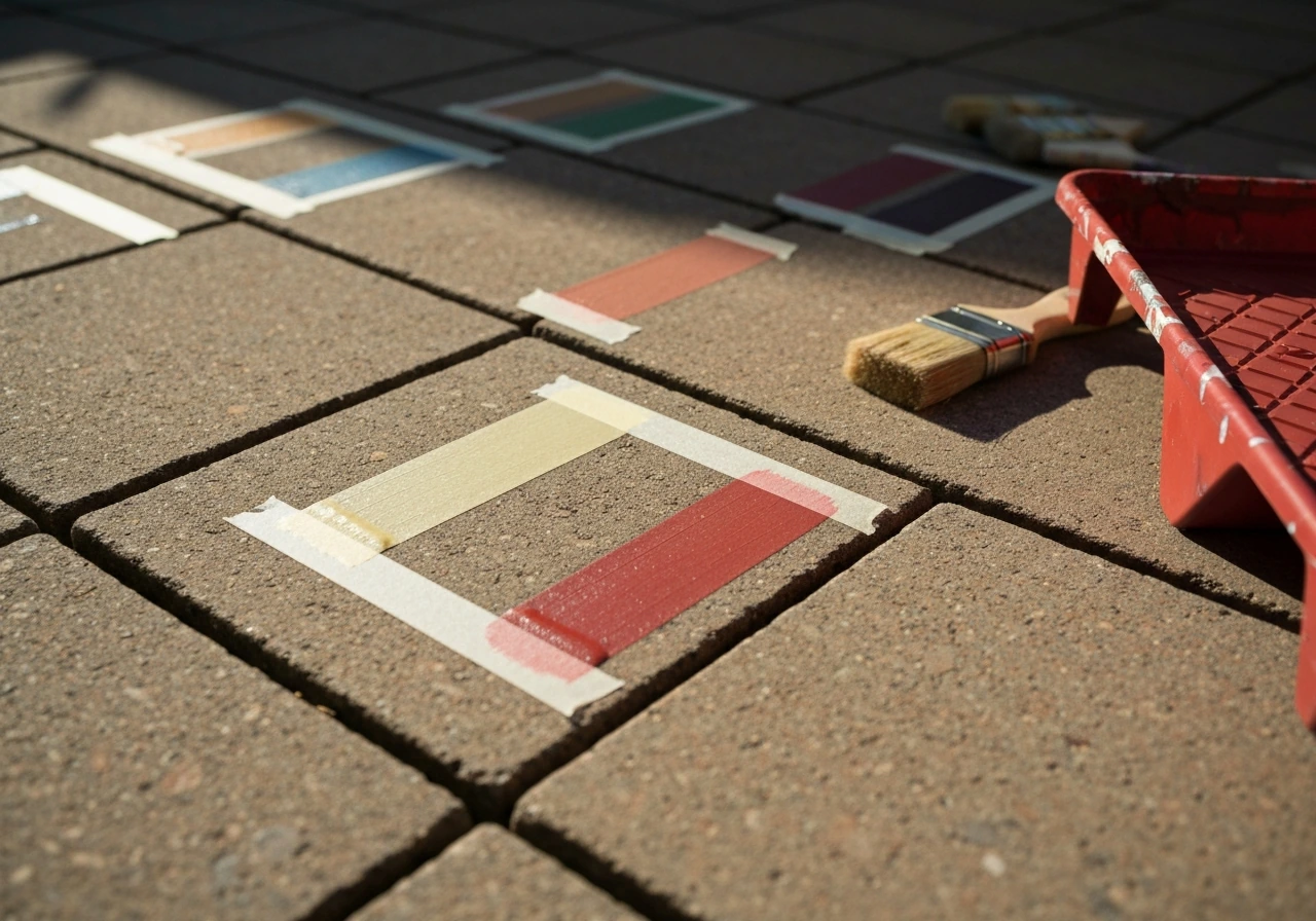
This step saves more headaches than any other. Colors behave completely differently in store lighting versus afternoon patio sun, and skipping this step is how people end up with a patio that looks wrong but they can't explain why.
Paint and stain testing
For any painted or stained surface, apply at least two coats of your sample color on the actual surface material (not a piece of cardboard or paper) and let it dry fully before judging. Wet paint can look up to two shades darker than the dried result, and a single coat often looks patchy and misleading.
Once it's dry, observe the same patch at three different times: morning light (often cooler and bluer), midday direct sun (the truest read of the color), and late afternoon golden hour (when everything shifts warmer and orange tones get exaggerated). A color that looks perfect at noon can look muddy or orange-heavy at 5pm, and vice versa. This time-of-day testing approach is well-established advice among painters for good reason.
It costs almost nothing to buy a sample quart and saves you from repainting an entire deck.
Fabric and cushion swatches
Order fabric swatches before ordering full cushions or rugs, and lay them on your patio furniture or floor in actual outdoor daylight, not indoors by a window. Hold the swatch against your fixed elements (the floor, the wall, the furniture frame) simultaneously. What you're looking for is whether they feel harmonious, not matching. If the undertone fight is obvious in your hand, it will be even more obvious at scale. Many online patio retailers offer free swatches, and it's worth the week wait to test them properly.
Quick rules to simplify the decision
- If you can't decide between two neutrals, pick the one that most closely matches your flooring's undertone.
- If your patio gets full afternoon sun, go one shade lighter than you think you want on any painted surface. Full sun intensifies perceived color.
- If your patio is mostly shaded, go one shade deeper than you think you want. Shade mutes color significantly.
- Test any fabric swatch in wet conditions too. Many outdoor fabrics shift noticeably when damp.
- When in doubt between two accent colors, pick the one that appears somewhere in your existing landscape or plantings. Nature already made the coordination decision for you.
What to expect over time: maintenance and longevity by color and surface
Being honest about what different color choices cost you in maintenance is just as important as how they look on day one. Here's a realistic breakdown.
Light colors
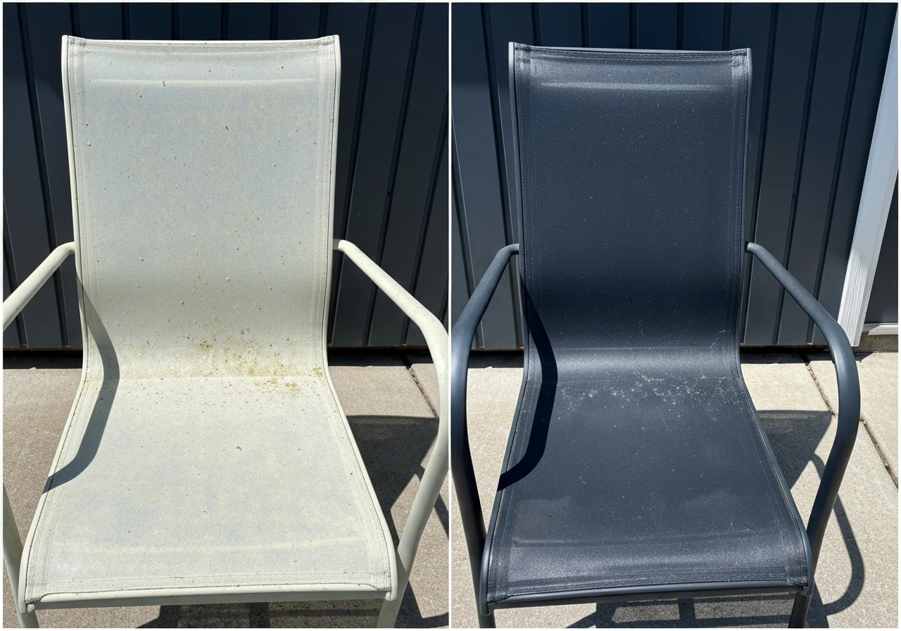
Light neutrals (white, cream, pale gray) stay cooler in the sun and feel open and airy, but they require more frequent cleaning. Pollen, bird droppings, dust, and mildew are highly visible, especially on horizontal surfaces. White concrete or light gray decking in a humid climate will need a pressure wash two to three times per season to stay looking clean. On the positive side, when light painted surfaces do chip or scratch, touch-ups are easier to blend, and light colors show UV fading less obviously because there's less color to lose.
Dark colors
Dark colors (charcoal, deep navy, dark brown) hide dirt remarkably well on vertical surfaces like furniture frames and walls, but they show dust, lint, and chalking from UV degradation on horizontal surfaces over time. More importantly, dark painted or stained surfaces in full sun fade in a way that's very obvious: a dark charcoal deck paint shifts toward a washed-out, ashy tone after two to three seasons of intense UV exposure. Refinishing costs money and time. If you commit to dark surfaces in full sun, use the highest-quality UV-resistant finish you can find and budget for a recoat every two to three years.
Mid-tones and muted colors
Medium-toned, slightly desaturated colors are genuinely the lowest-maintenance choice for outdoor surfaces. A warm sand or medium gray concrete paint, a medium brown semi-transparent deck stain, or dusty blue-green fabric all hide dirt acceptably, fade more gracefully (the shift is subtle rather than dramatic), and are easiest to touch up or refresh without a full redo. If you're optimizing for longevity over pure style, this is your lane.
Metal finishes specifically
Powder-coated metal in white or light colors shows rust bleed-through if the coating gets scratched and water gets underneath, which makes the damage very visible. Black or dark bronze powder-coat hides early rust staining much better and is more forgiving if the finish gets nicked. For coastal environments, powder-coated aluminum (rather than steel or iron) in any dark neutral is the smart choice because aluminum doesn't rust even if the coating chips.
Outdoor textiles over time
Even the best solution-dyed acrylic fabrics with lightfastness ratings of 7-8 will show some shift after three to five seasons of heavy direct sun exposure. The honest maintenance plan is to store cushions when not in active use (not just leave them outside year-round), bring them in during winter if you're in a climate with harsh winters, and replace them every four to six years if they're in heavy sun. Rugs typically need replacing sooner than cushions, around three to four years in full sun, because they get foot traffic wear on top of UV stress. Choosing a medium-tone, muted color in the first place means that when fading does happen, it happens more gracefully and the rug or cushion still looks intentional rather than obviously degraded.
Example palettes to get you started
Here are four proven patio palettes based on common setups. These aren't rules, but they're reliable starting points you can adapt.
| Patio Type | Floor Color/Material | Furniture Frame | Primary Cushion Color | Accent Color | Plants/Extras |
|---|---|---|---|---|---|
| Small shaded urban patio | Gray concrete (existing) | Black metal | Warm white linen | Terracotta (planters/pillows) | Tropical greens, ferns |
| Large sunny suburban deck | Warm brown composite | Dark bronze aluminum | Dusty navy blue | Olive green (rug, throw) | Ornamental grasses, lavender |
| Coastal/beachy patio | Light gray tile | White powder-coat aluminum | Soft teal / seafoam | Natural rope/rattan accents | Agave, ornamental sea grass |
| Modern/minimalist patio | Charcoal concrete or dark tile | Matte black metal | Light warm gray | Single deep forest green accent | Structured topiaries, boxwood |
Whatever palette you land on, remember that the rest of your patio setup plays a role in how the colors read. Thoughtfully chosen outdoor pillows, a well-matched bench, and even a good patio clock can either reinforce the palette or undercut it. A good patio clock is more than decoration; pick one that matches your outdoor conditions and stays readable for years. Color coordination is a whole-space exercise, not just a paint decision. The patios that look the most intentional are usually the ones where even the small accessories were chosen with the palette in mind.
Your next steps checklist
- Photograph your patio's fixed elements (flooring, siding, fencing) in midday light and identify whether they lean warm or cool.
- Measure your patio and note the sun exposure pattern across the day.
- Choose a neutral anchor direction (warm or cool) based on your fixed elements.
- Order two to three fabric swatches in your target color family and test them on the patio in real daylight before ordering full cushions.
- For any painted surfaces, apply two coats of your sample color on the actual surface and observe it in morning, midday, and late afternoon light.
- Pick one accent color and identify exactly two to three places you'll use it: a rug, a planter, an umbrella, or accent pillows.
- Check the lightfastness rating on any fabric you're considering. Aim for a Blue Wool Scale rating of at least 7 for direct sun exposure.
- Plan a maintenance schedule: pressure wash hard surfaces twice per season, store cushions in off-season, and budget for a deck/concrete recoat every two to three years if using a dark color in full sun.
FAQ
How many colors should I use on the patio so it looks intentional and not random?
Start by choosing your “anchor” neutral from the biggest fixed surface (floor, deck boards, or main wall). Then pick one accent color that appears in at least two accessories (for example, cushions plus a planter, or an outdoor rug border plus an umbrella). If you want a third color, make it a natural texture (wicker, wood, rattan) rather than a new pigment color, so you keep undertone consistency without overcomplicating the scheme.
What’s the safest way to use dark patio colors if my space gets very hot?
Use heat as your decision guide, not just appearance. If you get intense afternoon sun, avoid dark anchors on walk-on surfaces (floor/deck) because they absorb heat. Dark accents are safer when they are small and can be shaded most of the day, like a chair back, planters, or pillow covers. If you love dark, consider a dark option on vertical elements and pair it with a lighter neutral floor color.
Do I need to test colors differently for patios that get wet often (rain, misting, sprinklers)?
Check how your patio colors will look when wet. Stone, stamped concrete, and treated wood often darken and warm up after rain or hose-down, which can make undertone clashes show up. When testing samples, spray or lightly dampen a small area (or revisit your test during a humid period) so you can confirm the palette still works in its “wet” state, not only when dry.
How do I choose between warm white and cool white for my patio if I have existing stone or siding?
Yes, because “outdoor white” is rarely one true shade. In practice, compare a few undertones of white (warm cream, soft off-white, cool true white) directly against your existing materials in the same light you’ll live with. A warm beige exterior usually looks best with warm off-whites, while cool slate/gray surroundings can handle cooler whites without looking yellow or dirty.
My patio includes stainless outdoor kitchen items, how should that affect my color palette?
If your outdoor kitchen has a stainless grill or metal countertop, treat metal as a separate undertone category and unify everything else to it. Stainless often pulls cool, so pair it with cool neutrals (charcoal, slate gray, navy) or with warm neutrals that include the same “neutral intensity” (for example, warm white rather than bright cream). Avoid mixing a cool accent textile next to warm wood unless the undertone conflict is repeated in another accent piece.
Why do my outdoor rugs or cushions look different after a season, and how can I prevent that?
Don’t assume indoor rug or cushion colors will behave the same outdoors. Outdoor textiles often fade toward lighter, warmer tones under UV, especially reds and bright oranges. A practical workaround is to choose medium-tone, slightly desaturated shades for cushions and rugs, or keep bold reds/oranges to pillows that you can rotate and store, rather than permanent items that bake in full sun.
Which colors hide dirt better over time, light, dark, or medium, and why does it change?
Yes, by planning a cleaning-friendly maintenance routine around your chosen tones. Light neutrals usually need more frequent washing to stay bright, especially with pollen and bird droppings on horizontal surfaces. Dark colors hide debris better at first, but can show UV chalking on horizontal planes as they age. Many homeowners land on medium neutrals because they balance both issues, fading more subtly and hiding everyday grime.
If I can only change one item this season, what should I update first: paint, furniture cushions, or the rug?
When you change just one big piece, like repainting furniture or swapping cushions, your undertones can suddenly “fight” with the patio floor or stone. If you can only change one thing, make it the smallest or easiest-to-replace item first (pillows, umbrella fabric, rug) and test the palette with swatches in actual patio sun. Repainting large fixed areas is higher risk, so avoid committing until the overall undertone balance feels right.
What should I consider about metal color if I live near the ocean or in salty air?
For powder-coated metal, the finish matters more than the color name. If your patio is coastal or you get salty air, prefer aluminum over steel or iron because it resists rust even when coatings chip. If you have to use dark powder-coat, choose a dark neutral that matches your palette and inspect the frame regularly for any nick where water can creep underneath.
Why does a palette look good in photos but wrong on my patio in real life?
Pick furniture and cushion colors separately from painted or stained surfaces. A common mistake is matching perfectly at the “color family” level while ignoring undertones, which becomes obvious in afternoon sun. Use swatches outdoors next to your fixed materials, and also check comfort temperatures (heat absorption) for dark frames or seat cushions, because even if the color matches, it can feel unpleasant in direct sun.
Next Articles
Best Sunbrella Patio Cushions: Top Picks, Guide & Maintenance
Find the best Sunbrella patio cushions: durable, fade‑resistant picks, buying tips, care, and top recommendations.
Alternative to Patio Cushions: Durable, Stylish Options and DIY
Alternative to patio cushions: durable, weatherproof seating options, pros, DIY tips & buying guide.
Best Color for Outdoor Patio Cushions in 2026
Choose the best cushion color for sun, heat, and fading in 2026, with pairing tips for patio furniture and durability.